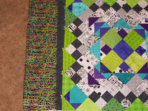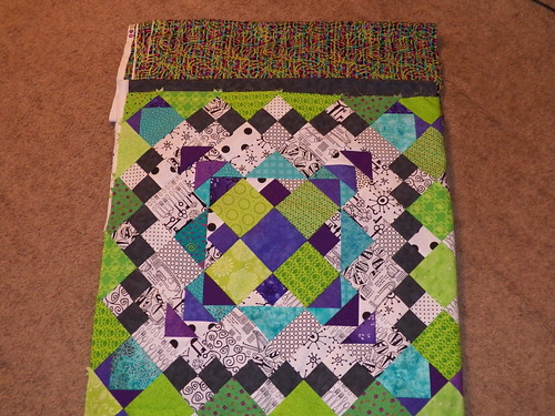
I found this fabric on fabric.com and I was hoping that the purple, teal and lime green would match well with the fabric in the quilt. The fabric is Fabrique-stan by Paula Nadelstern for Benartex.
I think that the teal and green look fantastic, but the purple is a little more of a cross between purple and pink.
I have the same mottled charcoal that is in the small 4 patches in the blocks as the inner border.

I was so hoping that I would love this fabric. Maybe it will grow on me in a few days.


4 comments:
I can understand your disappointment. Individually the colors in your border print coordinate with your quilt center, but it seems that the busy print is causing the eye to blend together the colors, resulting in kind of a reddish or golden cast to the overall print, which doesn't harmonize so well. You put SO MUCH work into your Easy Street top; maybe you might be happier choosing a different fabric for the border and using your print for the back or for another project.
I agree - I think it looks okay, but it doesn't pop, and with all that work, you want it to pop! Maybe you can find something in Shipshewana....just over a month away!
Oh I love it! I think it is gorgeous.
May I suggest trying to find a fabric with 2 of the 3 colors & charcoal in it for the outer border and using the 3 rd color for the inner border.? It may be easier to get the colors 'just right' that way. I love your Easy Street flimsy. It's beautiful!
Post a Comment